March 8 is more than a celebration. Here are 5 golden design rules from an advertising agency perspective to reflect women's strength, diversity, and resilience in your visual language.

Insight

March 8 is more than a celebration. Here are 5 golden design rules from an advertising agency perspective to reflect women's strength, diversity, and resilience in your visual language.

March 8 is far more than a date circled on the calendar. As a symbol of the struggle for social equality, this day demands that brands take a strong stance through their visual language as well. Yet many campaigns still present women as elegant, passive, decorative figures — hollowing out the message entirely. As of 2025, consumers instantly recognize superficial 'awareness' content and turn their backs on it. If you want your brand to genuinely resonate on March 8, it's time to rethink your visual strategy from the ground up.
The vast majority of March 8 campaigns present women as slim, white-clad, smiling figures. This design language sends a soft message — but not a powerful one. To visualize strength, consider the following elements:
Representation is not just a moral obligation — it's an effective communication strategy. A campaign built around a single type of woman excludes a large segment of society. Visual diversity checklist:
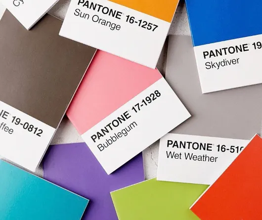
Pink and purple have become reflexive — and overused — choices in March 8 communications. They've lost their power to attract attention. To differentiate your visual language:
The typeface you choose is the visual reflection of how you speak. A thin, curvaceous font delivers a delicate message. A bold, geometric sans-serif communicates strength and clarity. Typography tips for March 8:
Even the most polished design falls flat without genuine intent behind it. To ensure your visual language aligns with your message, ask yourself:
What should brand communication look like on March 8?
March 8 brand communication should be sincere, consistent, and visually powerful. Rather than producing campaigns solely for this day, build a year-round brand stance that genuinely champions women's empowerment.
Which colors work best for March 8 designs?
While pink and purple are classics, they won't help you stand out. Earth tones, bold black-and-white contrasts, or red-orange combinations are powerful alternatives that will make your design shine.
How can diversity be achieved in March 8 visuals?
Feature women of different ethnicities, ages, body types, and professions. Avoid stock photography; whenever possible, opt for real stories and original creative production.
On March 8, your brand's visual language can be a statement of intent — or it can fade into the crowd. That choice is entirely yours. As the next-generation creative & digital advertising agency Babel, we help brands not just follow the agenda on every special occasion, but set it. Get in touch with us for original and strategic content production that creates genuine connections with your target audience.