Choosing a color may sometimes seem like a purely aesthetic decision. Yet the color a brand uses, the feeling created by a design, or the memorability of a package often begins with the choice of color.

Insight

Choosing a color may sometimes seem like a purely aesthetic decision. Yet the color a brand uses, the feeling created by a design, or the memorability of a package often begins with the choice of color.
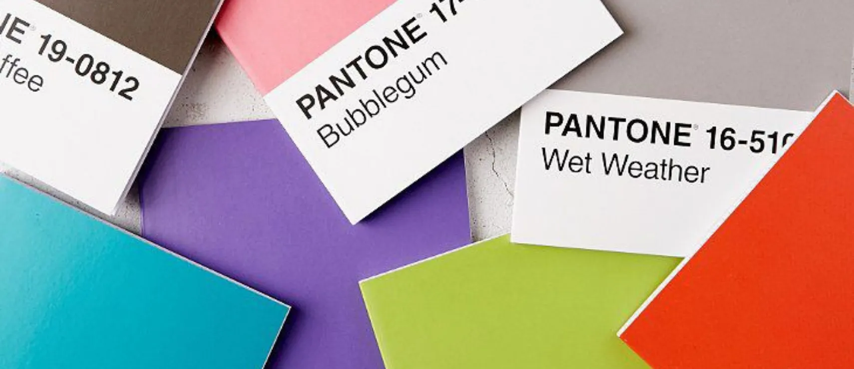
Pantone recently expanded the world of color a little further. A total of 224 new colors have been added to the Pantone Matching System. With these new additions, designers now have more options to work with, while Pantone’s new palettes also point to a bolder and more distinctive approach to color in the design world.
Where Did the 224 New Colors Come From?
The 224 new colors added by Pantone in September 2026 have been incorporated into the Pantone Matching System’s graphics color collection. With these additions, the total number of market-driven solid colors in the system has reached 2,614. The new colors can be used through physical color guides such as the Formula Guide, Color Bridge, and Solid Chips, as well as digitally through Pantone Connect.
Among the new colors, citrus-inspired yellows, richer purples, vibrant greens, pinks, and oranges stand out. Pantone’s approach is not simply about increasing the number of colors, but about giving designers a broader and more flexible space for visual expression.
Are We Moving Away from Minimalism?
For a long time, simple color palettes, neutral tones, and designs with as few visual elements as possible have dominated the design world.
Pantone’s new colors point in a slightly different direction. More vibrant, intense, and attention-grabbing colors are coming forward. Pantone connects this shift to the rise of maximalism and a move away from stark minimalism toward a bolder form of self-expression.
This shift does not simply mean “using more colors.” Instead, colors are increasingly being treated as part of the feeling a design is meant to create, rather than as details randomly added to a composition.
What Kind of World Are the New Colors Creating?
Pantone has also grouped the 224 new colors into four different palettes: Desire for Pleasure, Desire for the Exquisite, Oxygenating, and Beyond Boundaries.
These palettes create very different worlds. One brings together more playful shades such as pink, aqua, and pistachio green, while another combines richer colors such as chocolate, grape, peach, deep red, and orange.
The Oxygenating palette creates a more energetic feeling through greens and yellows inspired by nature, while Beyond Boundaries brings together contrasting shades such as aqua, lavender, purple, lime green, and cream within the same story.
Why Does a Color Matter So Much?
A brand’s color can be one of the first visual details people notice when they encounter it. The colors used in a logo, package, social media content, website, or advertising design can directly influence how a brand is perceived.
That is why the introduction of new colors means more to designers than simply having additional options. It also creates room for previously unexplored combinations, different visual identities, and new ways of communicating.
Especially at a time when brands often exist within increasingly similar visual worlds, choosing the right color has become one of the important elements that defines the character of a design.
Does More Color Mean More Freedom?
The addition of 224 new colors gives designers more options. But having more choices does not mean every design needs to use more colors.
The real question is knowing how to use the right color in the right place.
Sometimes, a single strong color can define the entire character of a design. At other times, bringing very different shades together can strengthen the story a brand wants to tell. What matters is not simply that the colors look good, but that they create a meaningful relationship with the design as a whole.
Frequently Asked Questions
How many new colors did Pantone add in 2026?
Pantone added 224 new colors to the Pantone Matching System in September 2026. With these additions, the total number of solid colors in its graphics color collection reached 2,614.
Which shades stand out among the new Pantone colors?
Vibrant yellows, citrus tones, greens, purples, pinks, and oranges stand out among the new additions. Overall, the colors offer a more vivid and saturated visual language.
What do the new Pantone colors mean for designers?
The new colors offer a wider range of choices and more room for expression across brand identity, packaging, graphic design, and other visual communication projects.
A Design Language Beyond Color
Pantone’s new colors are not simply 224 additional options. The expansion of its color palette also reflects the direction of visual language in the design world.
The rise of more vibrant, personal, and daring colors shows that design wants to communicate more than simply “looking good.” Choosing a color can become the starting point for many decisions, from how a brand wants to make people feel to the message it wants to convey.
As the new generation creative and digital advertising agency Babel, we see design not simply as a visual application, but as one of the ways a brand expresses itself. From color and typography to visual identity and digital content, we focus on making sure every detail speaks the same language as the brand’s character.
Because sometimes, what makes us remember a brand is not the first sentence we hear, but the first color we see.