

Pinterest 2026 Colour Palette | Bursa Advertising Agency
Pinterest has announced its 2026 colour palette. These colours, ranging from Cool Blue to Persimmon, signal a new era in branding, design and communication. We examine the impact of trends on brands from an advertising agency perspective.
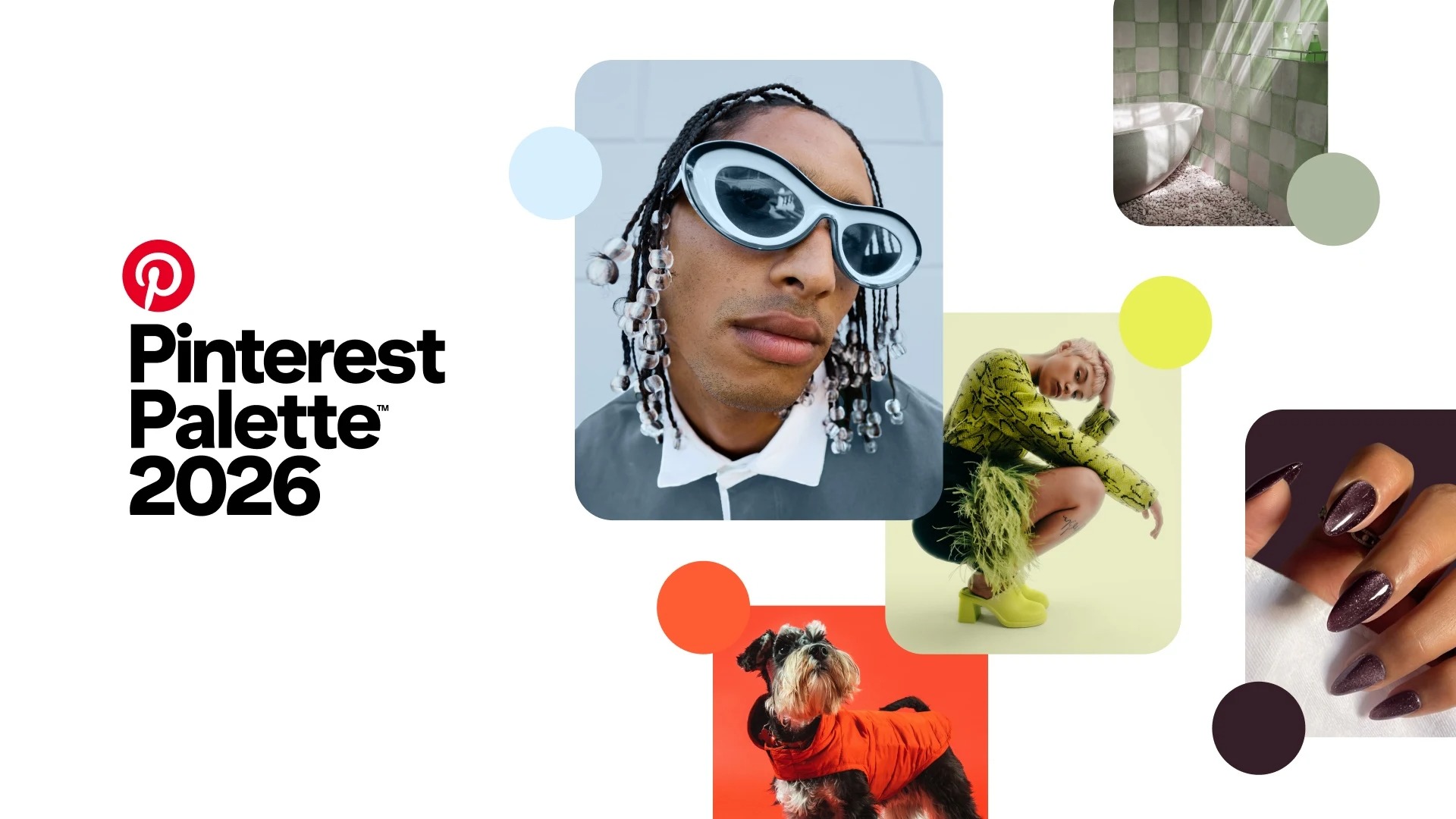
Pinterest has announced the colour palette that will influence the creative world in 2026. This palette is not only based on aesthetic preferences but also on the behavioural data of millions of users. With the impact of colours on brand perception becoming stronger than ever, these reports provide critical guidance for strategic decisions. For brands positioned in the local market and businesses seeking advertising agencies, correctly interpreting these trends directly impacts their communication power.
How is the Pinterest colour palette created?
Pinterest's annual colour palette is prepared by analysing the search, save, and interaction data of over 600 million active users.
This approach makes emerging trends in decoration, beauty, fashion, and digital design visible at an early stage.
This approach reveals emerging trends in decoration, beauty, fashion, and digital design at an early stage. Xanthe Wells, Vice President of Global Creative at Pinterest, summarises this transformation as follows:
‘For a long time, the safest option was to keep everything quiet and neutral. Now people are ready for more.’

1. Cool Blue
After the long dominance of beige and nude tones, Cool Blue creates a refreshing break. It stands out as a clear, cool, and modern tone.
Key data:
230% increase in searches for ‘icy nails’
85% increase in searches for ‘cool blue’
Areas of use:
Corporate office decor
Minimalist web and app interfaces
Beauty and skincare brands

2. Jade
Jade is a refined tone that goes beyond the classic perception of green, positioned between mint and seaweed green. It powerfully reflects the concept of quiet luxury.
Noteworthy data:
450% increase in searches for ‘jade marble nails’
This increase indicates that Jade will become particularly prevalent in serene interior designs, such as jewellery and accessory stores and beauty salons.

3. Plum Noir (Dark Plum)
Plum Noir is a melancholic, deep and characterful tone. It evokes a grotesque aesthetic and creates a strong brand stance.
Data insight:
230% increase in searches for dark plum
A prominent choice for fashion, premium products and bold brand identities.

4. Wasabi (Nature's Energy)
Wasabi is an energetic and eye-catching green tone. It represents the unbridled power of nature.
Key data:
175% increase in searches for ‘chartreuse green’
A powerful accent colour for digital campaigns, posters and social media creatives.
5. Persimmon (The Warmth of Orange)
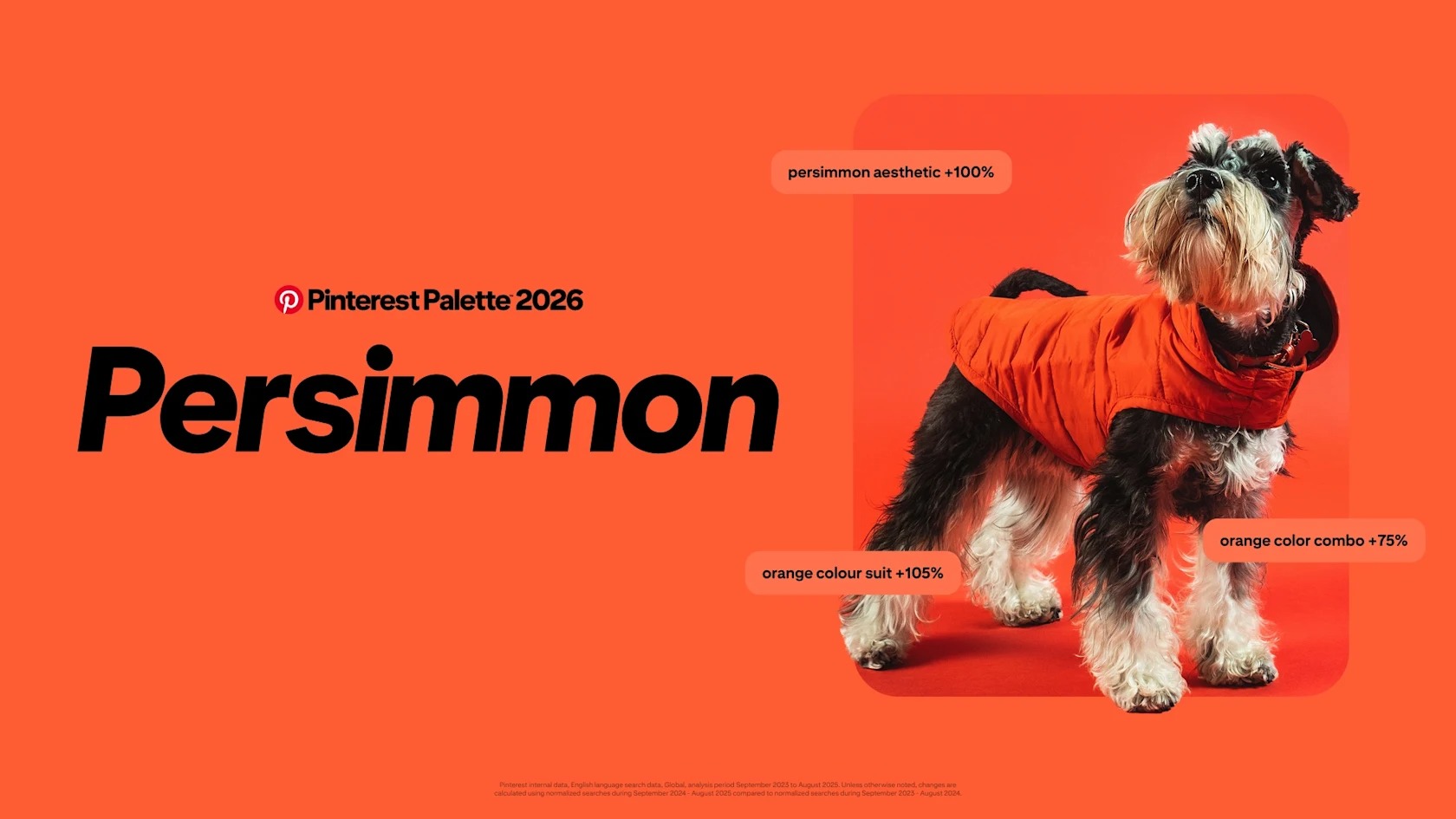
Persimmon is a warm and cheerful interpretation of orange. It creates a feeling of energy and optimism.
Noteworthy data:
105% increase in searches for ‘orange suit’
It is expected to create a strong emotional connection for event, retail, and lifestyle brands.
Frequently Asked Questions
Why is the Pinterest colour palette important for brands?
Because it shows, based on data, which colours users will gravitate towards in the future.
Should these colours be used exactly as they are?
No. The important thing is to adapt the emotion conveyed by the colours to the brand identity.
How can local brands benefit from these trends?
By combining the right colours with stories that resonate with the local target audience.
Conclusion: Colour is not aesthetics, it is strategy
Pinterest's 2026 colour palette offers brands an open invitation to create a bolder and more emotionally charged visual language. Colours are no longer just a design choice; they are a tool for perception, trust and connection.
As Babel, a creative and digital advertising agency in Bursa, we transform these global trends into meaningful and actionable strategies for local brands. When the right colour, the right story, and the right medium come together, brand perception becomes lasting.