We provided comprehensive digital solutions for Turkey's leading digital business card brand.
Projects we've worked on
with dedication and proudly shared.
We developed modern web and mobile applications for LAS Dakar Airport, the capital of Senegal.
We have completed the logo, brand identity, and website design for the global automotive aftermarket brand Orex.
We conducted naming, logo, and brand strategy work for HUBA, the umbrella organization of Hıdırusta.
We provided Latro, offering chemical solutions, with a website featuring a low carbon footprint and comprehensive agency services covering all aspects.
We developed user-friendly web and mobile applications for SKT, Turkey's oil seal brand.

We designed and developed a user-friendly, modern, award-winning website for a leading staffing agency for global organizations.
We provided support in the web design processes for Dent Group, one of Turkey's leading dental health centers, and developed their mobile applications.
The first mobile platform allowing you to buy and rent boats quickly and easily with just a few taps from your mobile device.
We have developed a functional website to represent the Rota brand globally, which manufactures parts for commercial vehicles, agricultural machinery, and construction equipment.
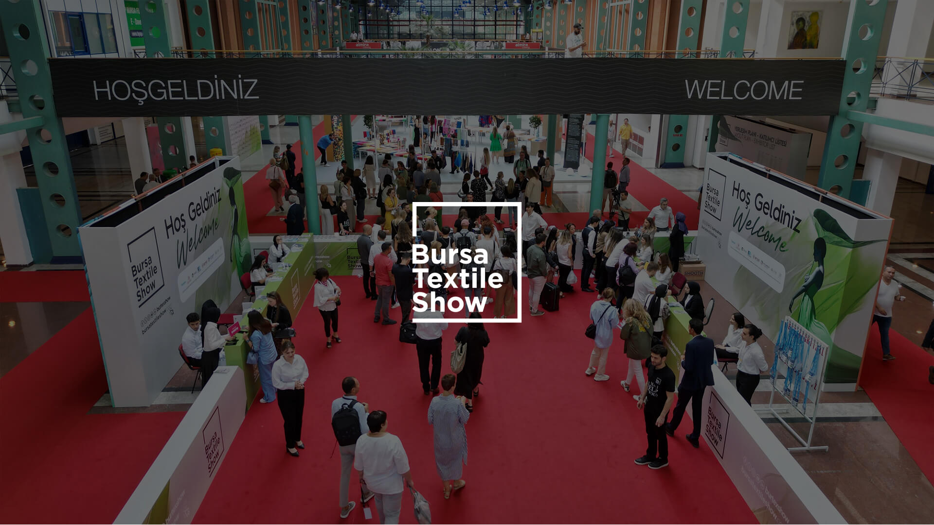
We provided support in branding, graphic design, web design, event marketing, and social media for this interdisciplinary event focused on the textile industry.
We designed and developed a website for Elkon, specializing in low-voltage electrical equipment and automation systems for the maritime industry.
We crafted a maritime-inspired logo and corporate identity design for Etki Liman, Turkey's first FSRU (Floating Storage and Regasification Unit) port located in Izmir, reflecting the essence of the maritime industry.
We designed and developed a high-quality international user experience website for Fuchs Sports, one of Europe's leading amateur sports broadcasting platforms.
We specialize in creative design, social media management, digital marketing, and production for IIFF (International Istanbul Furniture Fair), which is Europe's largest furniture exhibition held in Istanbul.
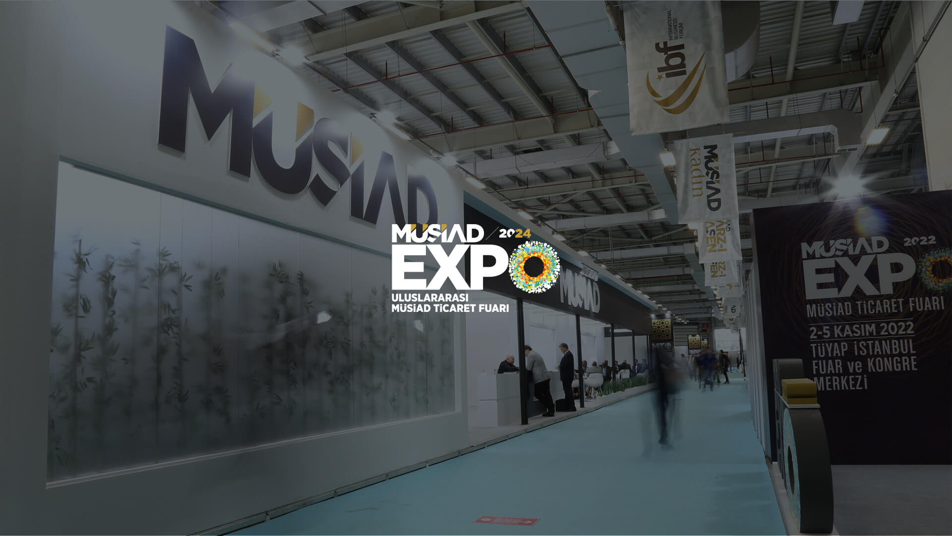
We provide creative design, production, social media, and digital marketing services for MÜSİAD EXPO, which is held in Istanbul and considered one of Turkey's largest business events.
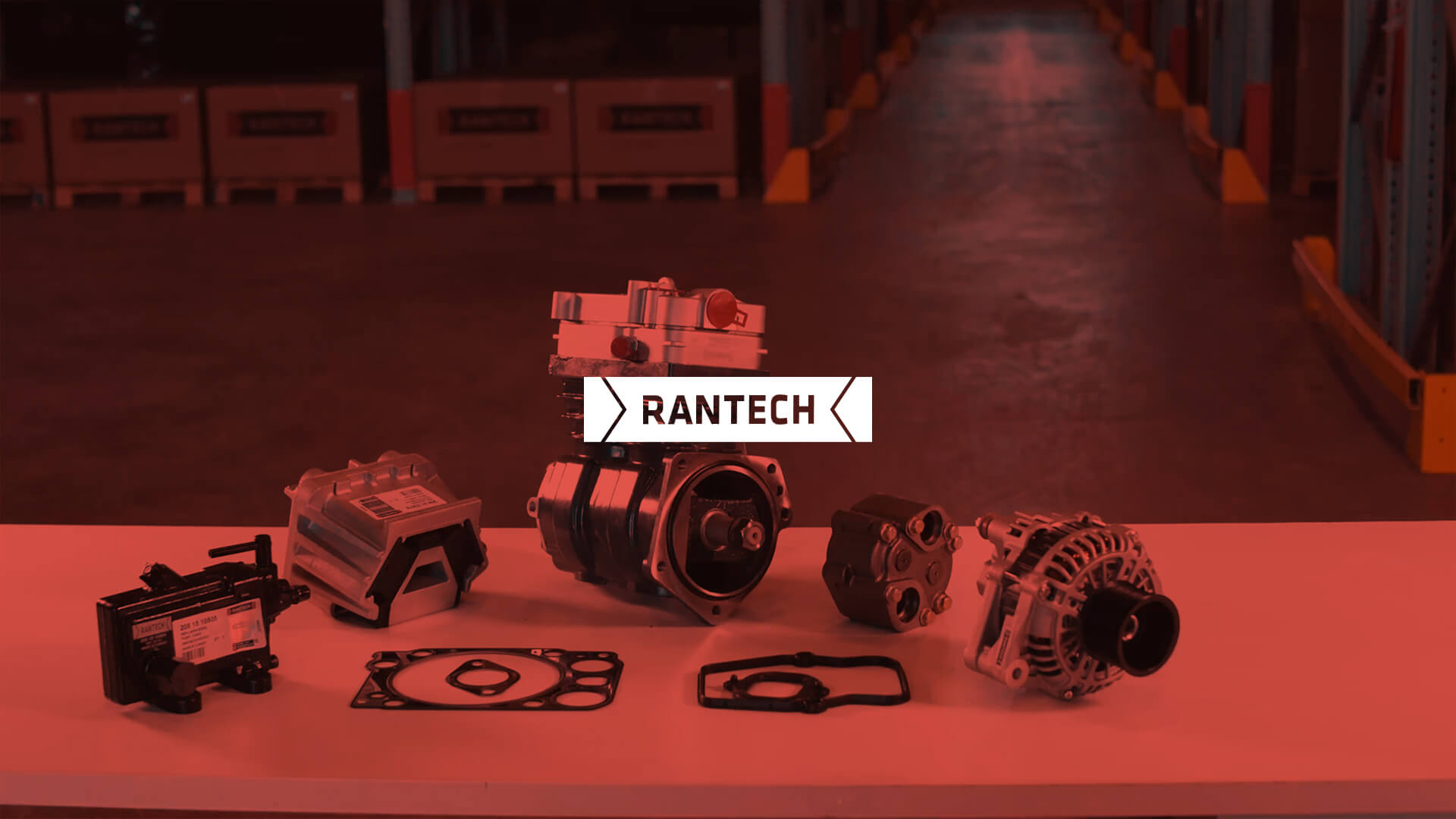
We have designed a corporate identity and a user-experience-focused website for Rantech, your sole business partner for all commercial vehicle spare parts needs.
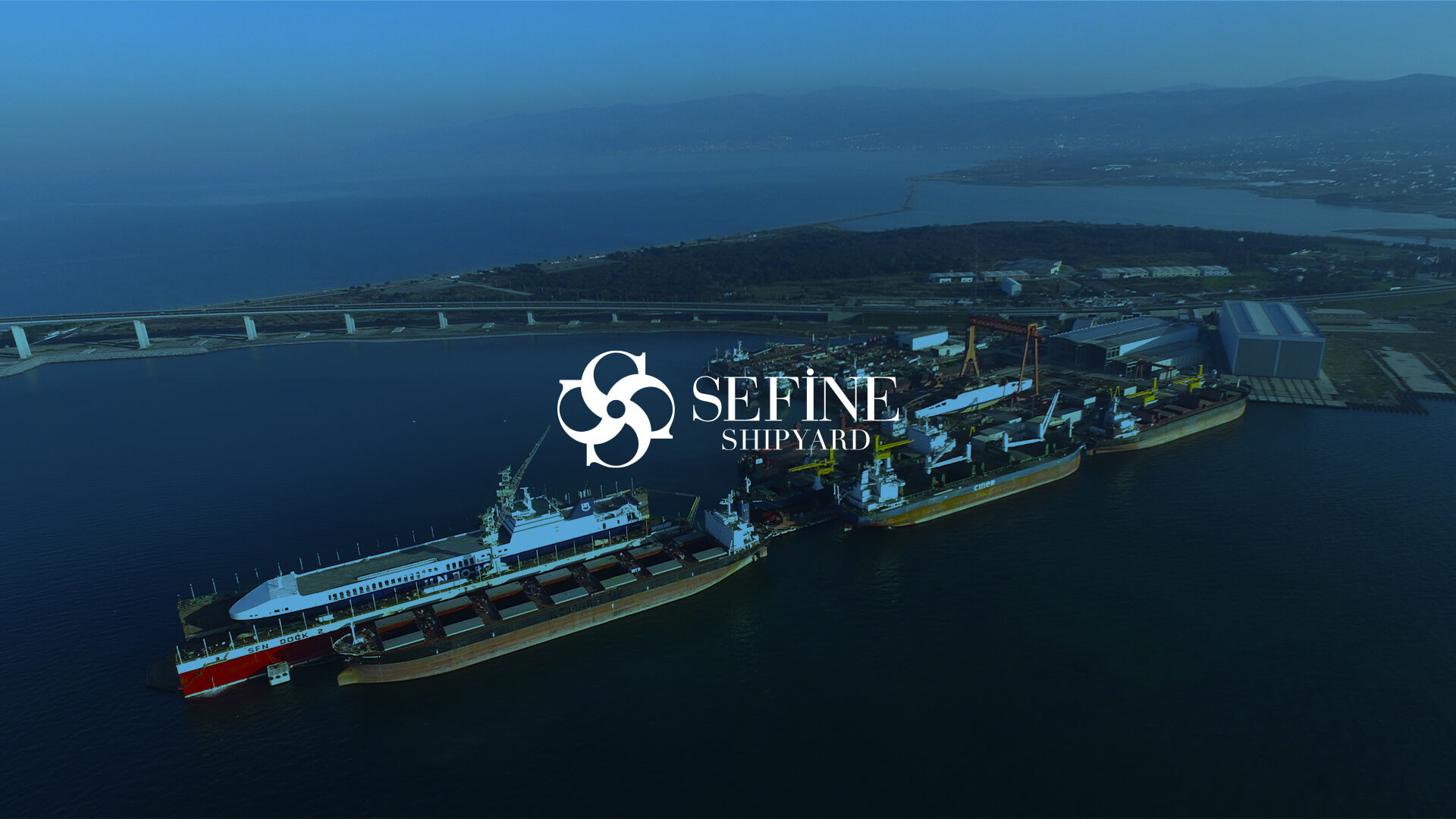
We provided logo and corporate identity design, website design, video production, and comprehensive 360-degree agency services for Sefine Tersanesi, one of Turkey's largest shipbuilding yards.
We have developed a modular and user-friendly website with a flexible CMS structure for a brand specializing in global certification capabilities, flightworthiness approvals, and modification engineering expertise.
We are delighted to present Yaşalar, a company with a deep-rooted history specializing in the production and processing of various metal products, showcasing their design and development efforts to you.
Vibuy is a video eCommerce platform that allows brands to sell from video content and analyze analytics from customer interactions.
With more than 30 years of experience in the ready-to-wear sector, Ebru Group stands out with its innovative and trendy products. We developed a user-friendly and modern website for Ebru Group.
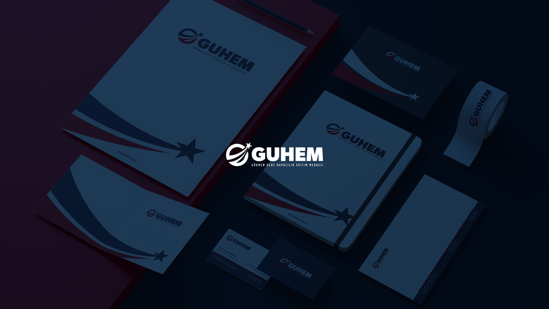
We successfully designed the logo, corporate identity and animation designs for GUHEM, Turkey's first space and aviation themed interactive center.
With more than 30 years of knitted fabric experience, we created a timeless logo and corporate identity design for İLMEK, which operates in the textile industry.
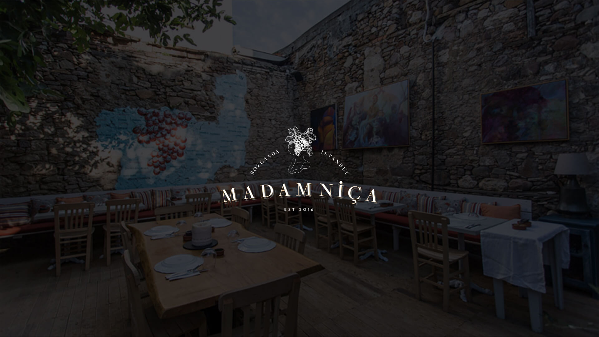
Madam Niça is the perfect choice for those who want to collect pleasant memories in Bozcaada and Istanbul with its texture, unique atmosphere and delicious food.
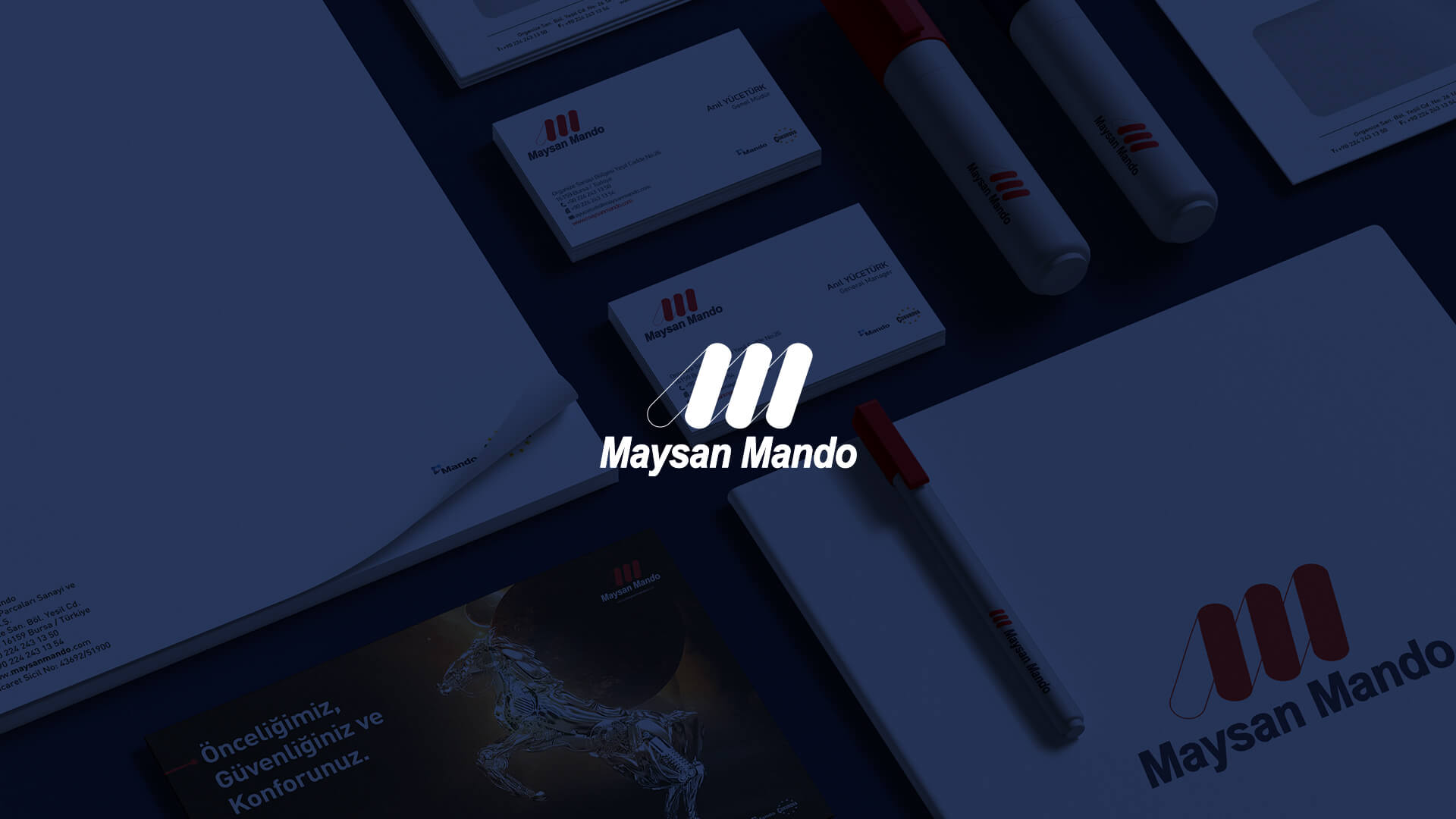
Maysan Mando is Turkey's leading suspension and shock absorber manufacturer operating in the automotive industry.
We designed the brand identity and developed the website of Özkurt Law, which provides high-level legal services to local and foreign clients in national and international areas.

The Economic Cooperation Organization Education Institute (ECOEI) is an autonomous organization of the Economic Cooperation Organization (ECO), working to contribute to the development of Member States through education.
We developed a website that prioritizes user experience for the Turkish Air Sports Federation with its 16 different air sports branches, athletes and clubs.

BST WATER aims to promote the efficient use of water by focusing on the sustainable management of water resources. For BST WATER, we developed a creative website with a high user experience that makes a difference in the sector.
Doing effective work, designing remarkable products, creating great experiences and achieving important results requires a real partnership. That's why we have been here for a long time and we are with you every step of the way.


